InterVarsity Logo - Zip Files
This zip files below include the entire set of the 2018 InterVarsity logo. Please make sure to read the "READ ME" PDF for information on which file to use for which situation. And also, refer to the Brand Book for further information on how to use the logo properly.
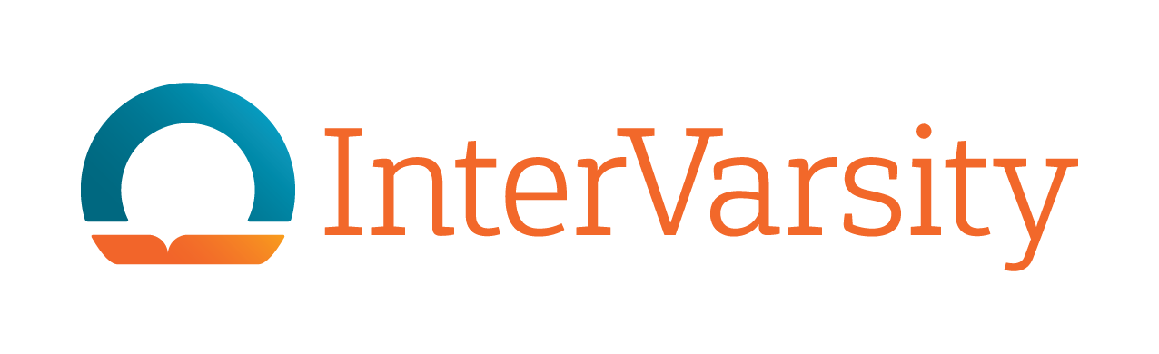
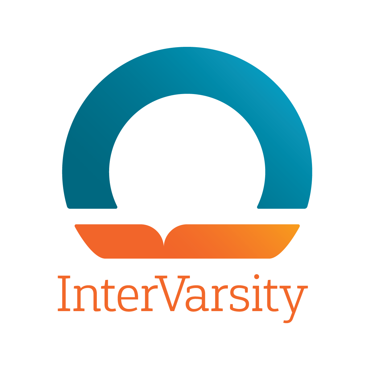
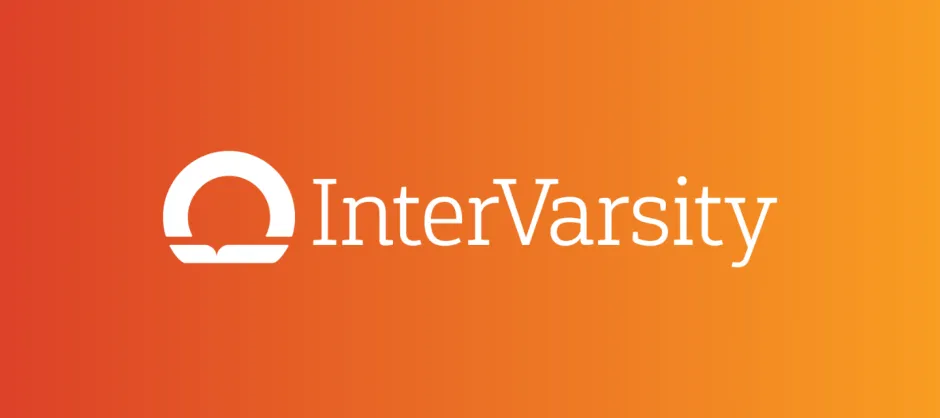
LOGO | WHAT IT MEANS
We use a pictoral mark in our logo. It communicates the most important and distinctive characteristics of our brand: the foundation of Scripture in all we do, and our desire to bring light to the world through our ministry on campus. The shape is intentionally abstract and simple, to be filled up over time with positive associations through experiences with InterVarsity’s people, events, and books. The slab serif font, Gaspo, has a collegiate appearance while also feeling light and contemporary. The wordmark is spelled with lower and uppercase letters because it gives our name a more approachable, friendly, and modern feel, and so we all know the V is capitalized!
- InterVarsity Horizontal Logos (zip)
- InterVarsity Vertical Logos (zip)
- InterVarsity Logos Email Signature Files (zip)
- InterVarsity Logos 2030 Calling (zip)
- InterVarsity Logos _MACOSX (zip)
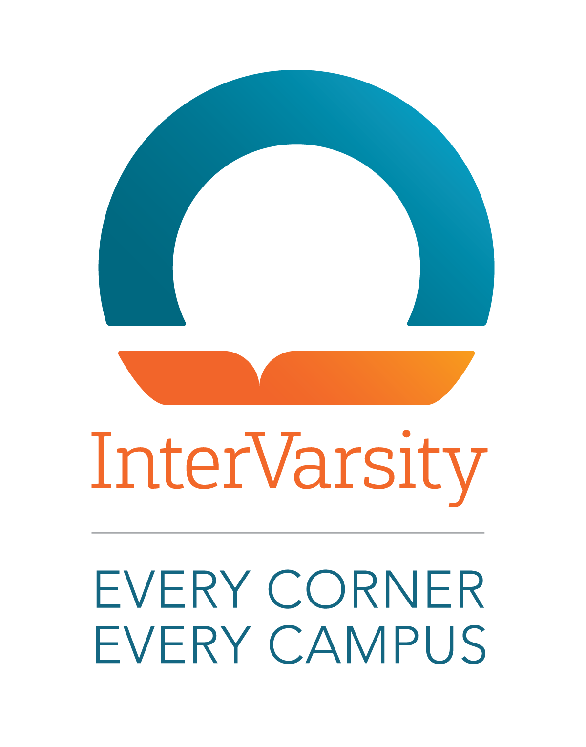
- InterVarsity Logos Every Corner Every Campus Horizontal (zip)
- InterVarsity Logos Every Corner Every Campus Vertical (zip)
- InterVarsity Logos Vertical Small less than 1 inch or 100x wide (zip)